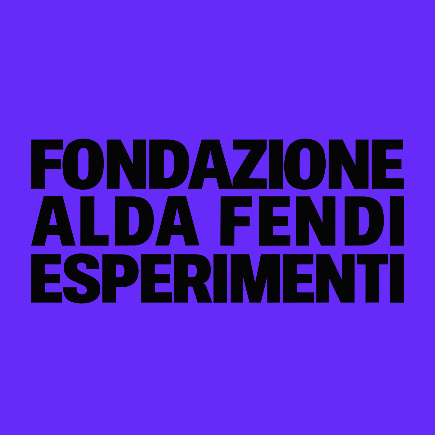
Fondazione
Alda Fendi
– Esperimenti
A new visual language
A rebranding for Fondazione Alda Fendi – Esperimenti, bringing its visual identity, a custom typeface and its digital presence into one graphic system.
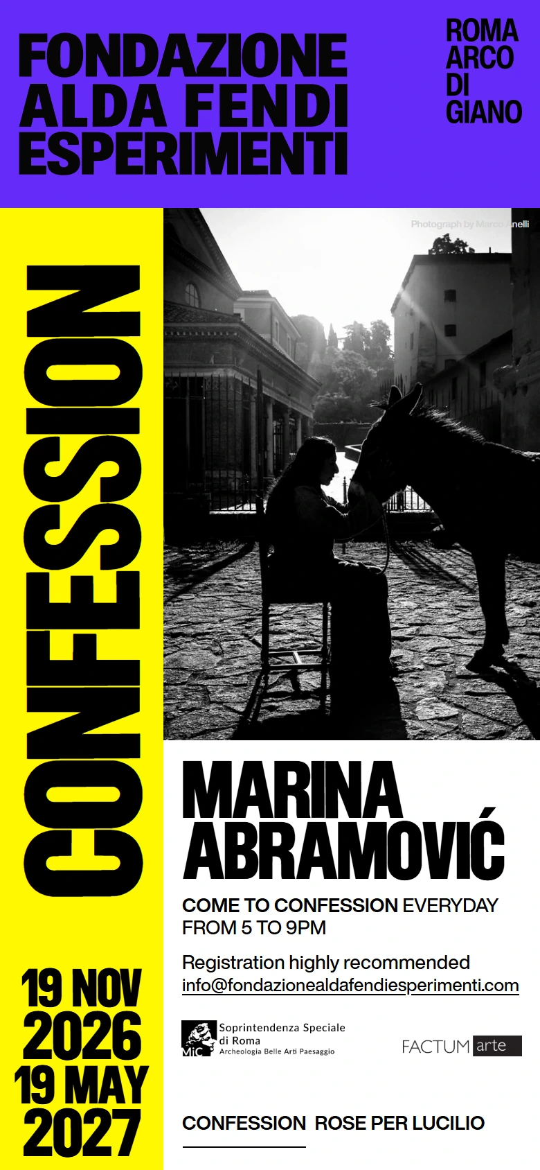
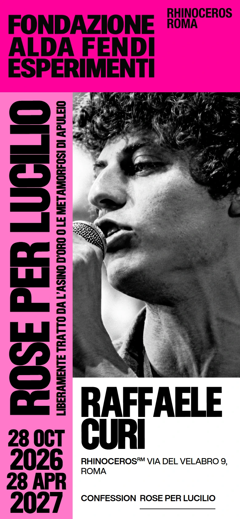
Oversized lettering, vivid colour fields and black-and-white photography form a modular language. A clear grid holds these elements together, giving each experiment its own composition while keeping the foundation immediately recognisable.
- Scope
- Rebranding, type design & web design
- Art direction
- Ignazio Morello
- Year
- 2026
Alda, a custom voice
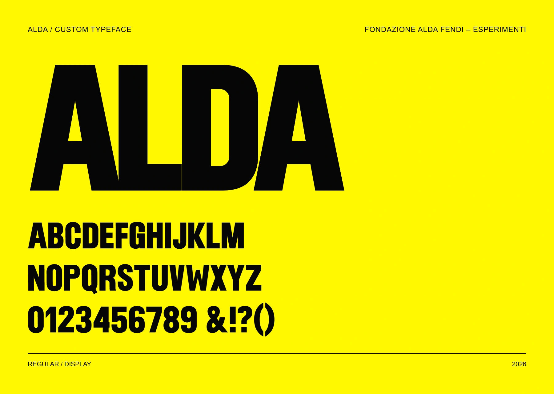
Alda is the custom typeface created for the rebranding. Condensed proportions, dense black shapes and subtly irregular contours give the foundation a distinctive typographic voice.
Used for exhibition titles, artists' names and dates, it becomes a structural part of the identity: the lettering fills the grid and gives each composition its rhythm.
A grid in motion
The foundation's landing page translates the identity into a continuous sequence of moving compositions. Colour fields expand, letters enter and leave their frames, and photographs are revealed as the grid shifts from one event to the next.
The launch pairs Confession by Marina Abramović with Rose per Lucilio by Raffaele Curi. Each event has its own colour combination, while the shared structure keeps both recognisably part of the same identity.
The same grid, reconfigured
The layout responds by repositioning its elements. On a wide screen, the artist's name sits beside the photograph; on a vertical screen, it moves below it. The title rail and the foundation's masthead hold the composition together in both formats.
Typography, images and colour fields adapt as a single system, preserving the identity's proportions and hierarchy across screen sizes.