SUPERVISIONE
Concept
The name Supervisione carries a deliberate double meaning: "Super-vision"—the ability to see what others cannot, to perceive creative possibilities beyond the obvious—and "Supervision"—the strategic oversight and guidance of visual identity development.
This duality defines the agency's approach: combining exceptional vision with expert direction. The identity draws from humanity's oldest visual language to communicate this role as both visionaries and guardians of creative communication.

The Mark
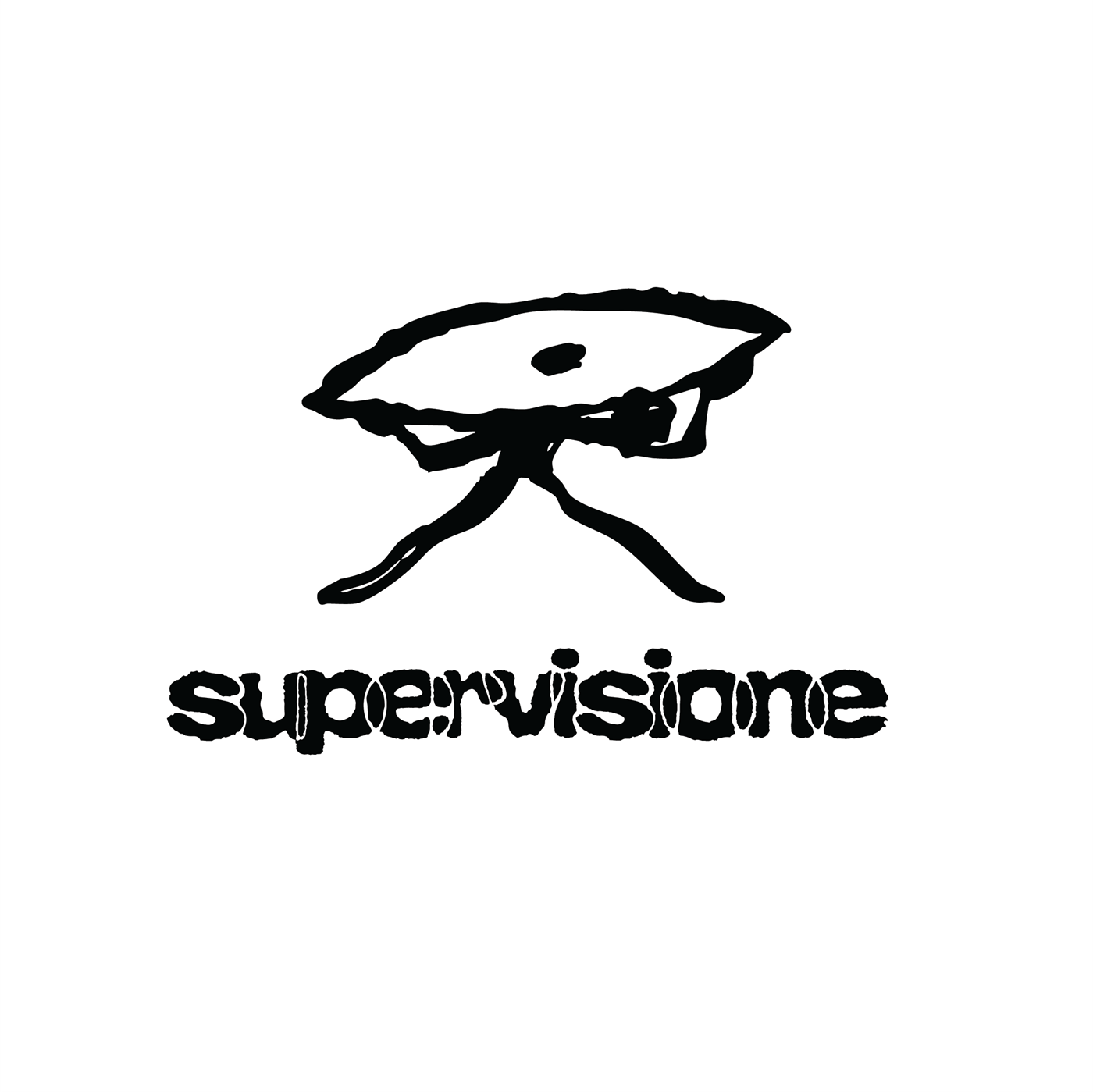
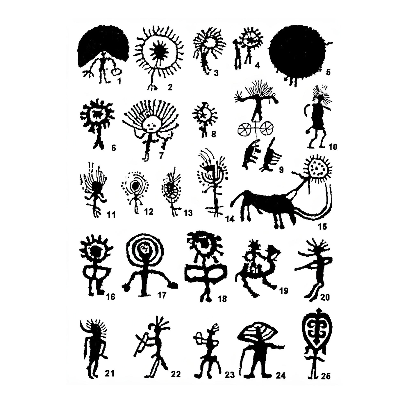
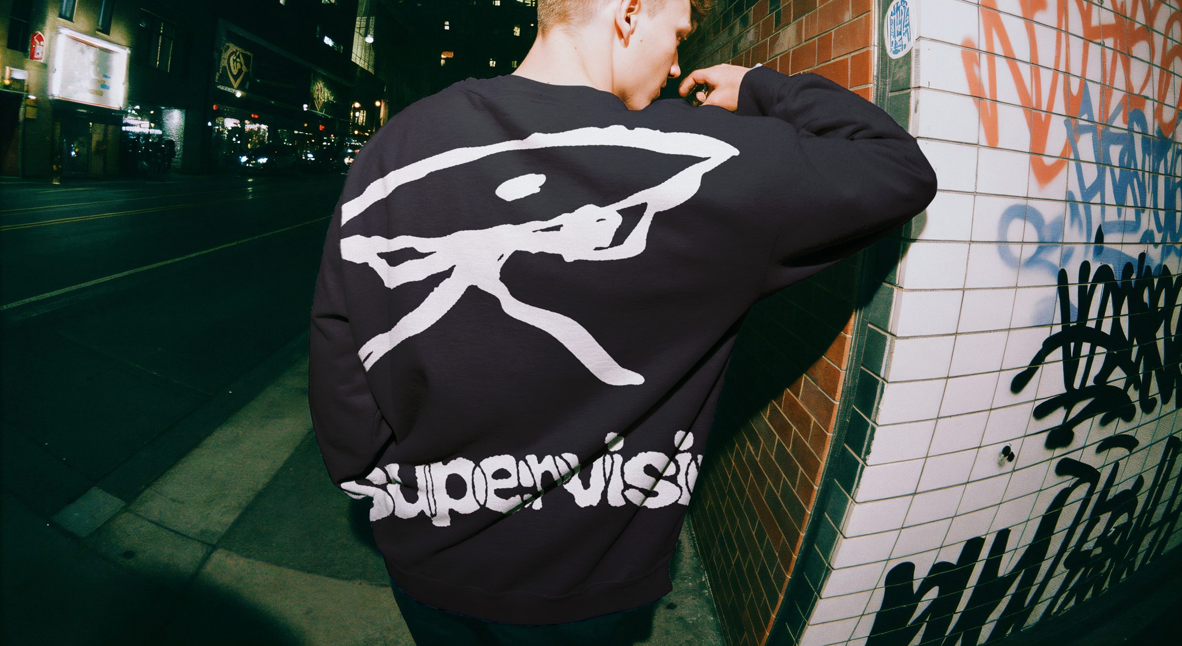
The pictogram takes inspiration from archaic drawings, cave paintings, and prehistoric petroglyphs—humanity's first attempts to communicate vision and understanding.
The eye-figure hybrid represents the watchful, strategic perspective that Supervisione brings to creative projects, while its primitive aesthetic suggests raw, unfiltered creative power and timeless wisdom.
The Logotype
The custom wordmark is rooted in a raw, primitive aesthetic, reflecting the agency’s position at the intersection of instinct and intentional design. The irregular, hand-carved quality of the letterforms suggests movement, transformation, and breaking conventional boundaries—core values in creative business development.
Application
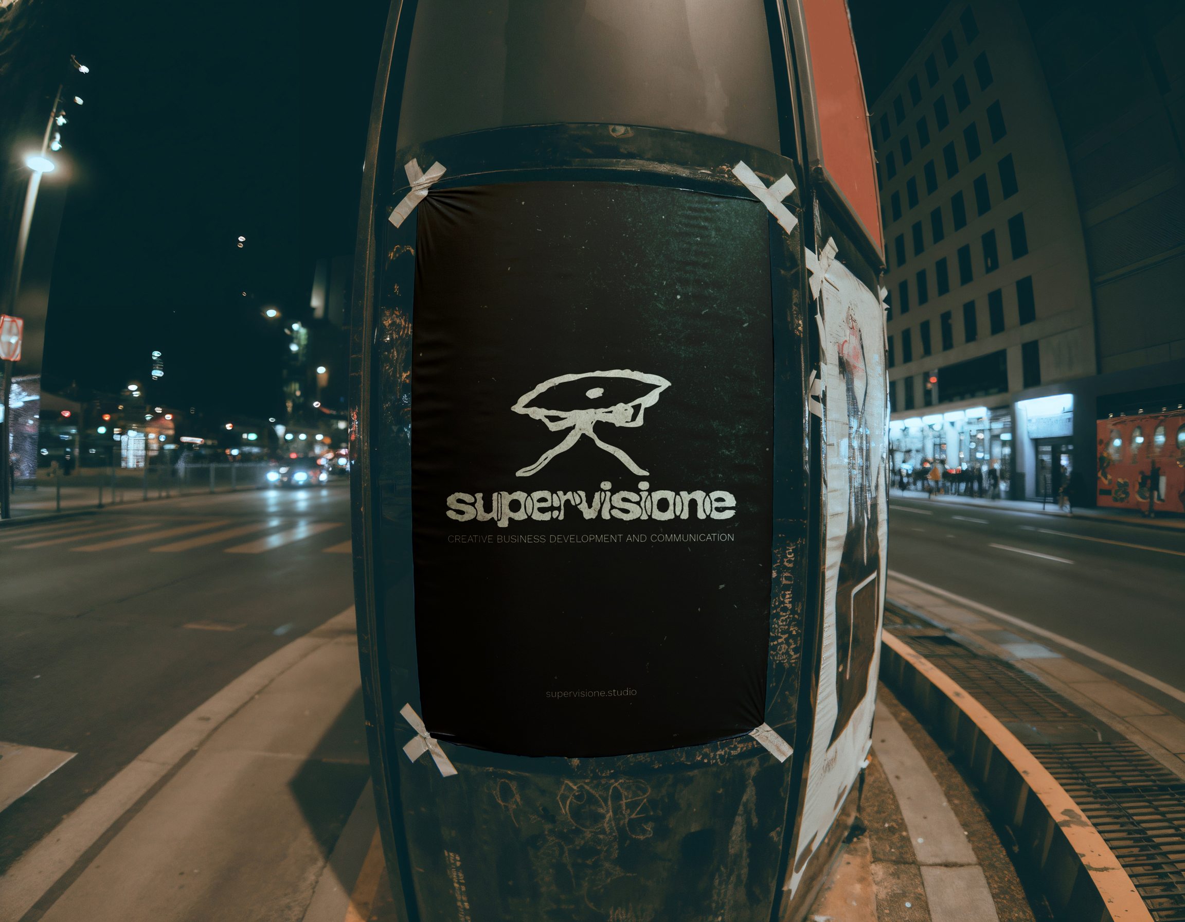
The monochromatic palette ensures versatility across media, from physical applications to digital presence, allowing the distinctive mark to maintain its impact in any context.