LUNA
BAKERY
MELBOURNE
Concept
This project involved the design of the visual identity for Luna, a new bakery and café in Melbourne offering handmade, European-inspired baked goods, produced daily with a strong focus on artisanal quality.
The brand reflects a space that feels bohemian yet minimal, warm and approachable without excess or nostalgia.
The Logo
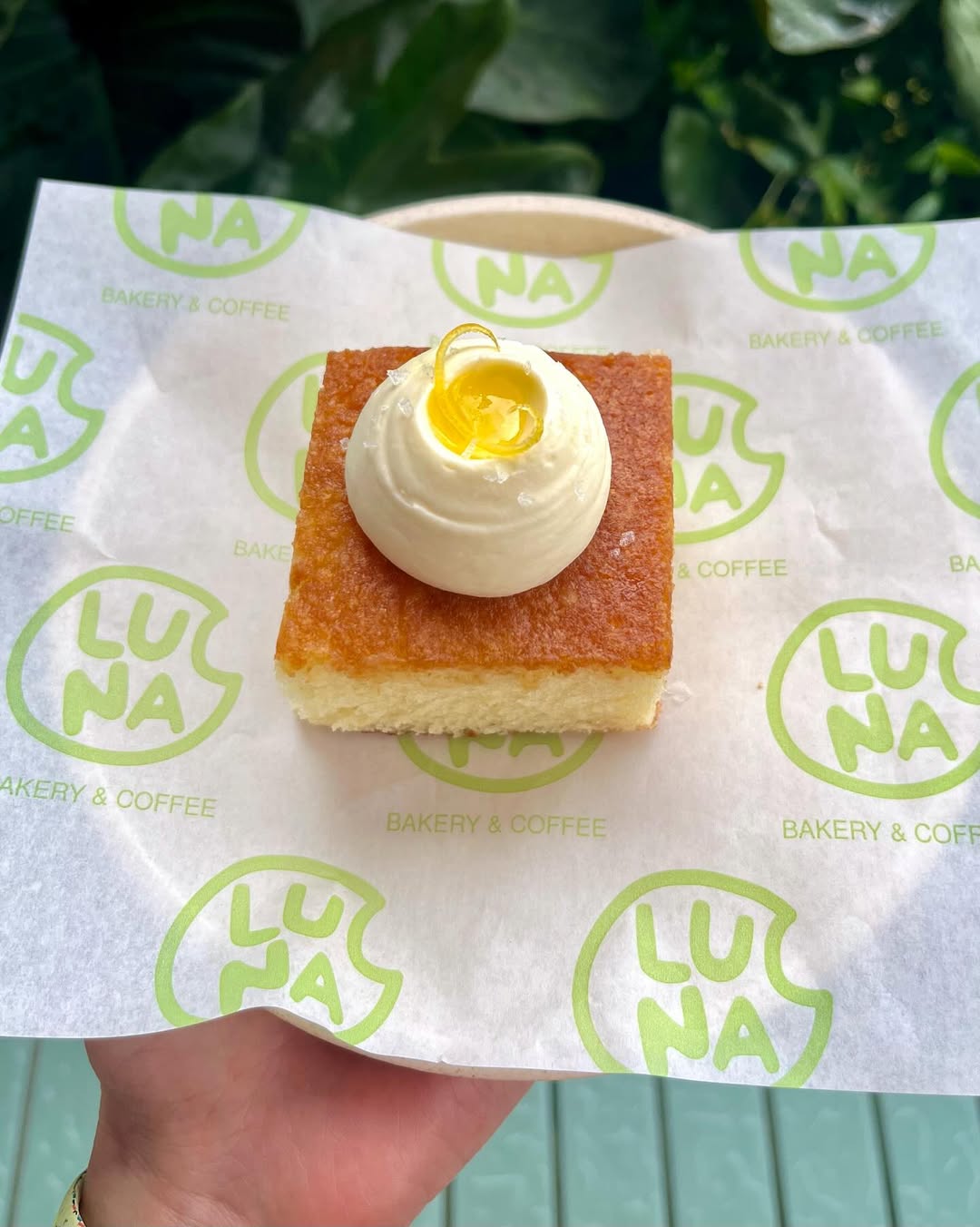
At the heart of the identity is a simple, layered logo: a minimalist interpretation of a cookie with a bite taken out, which also subtly reads as a crescent moon—a playful reference to the name Luna.
The mark balances friendliness and clarity, remaining bold and recognisable across signage, packaging, and urban applications.
Typography
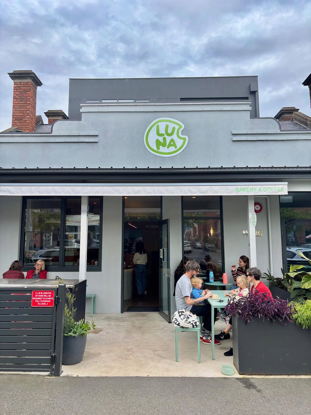
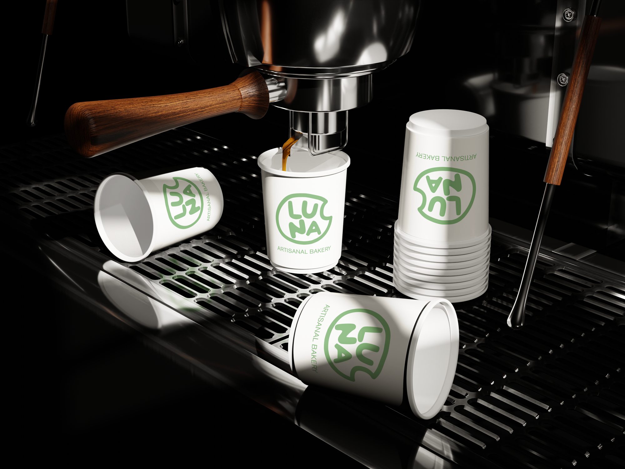
The custom “Luna” wordmark is expressive and light-hearted, and is paired with a grotesk sans-serif typeface for supporting text.
This typographic contrast gives the brand a contemporary, no-frills tone while still communicating care and attention to detail.
Context
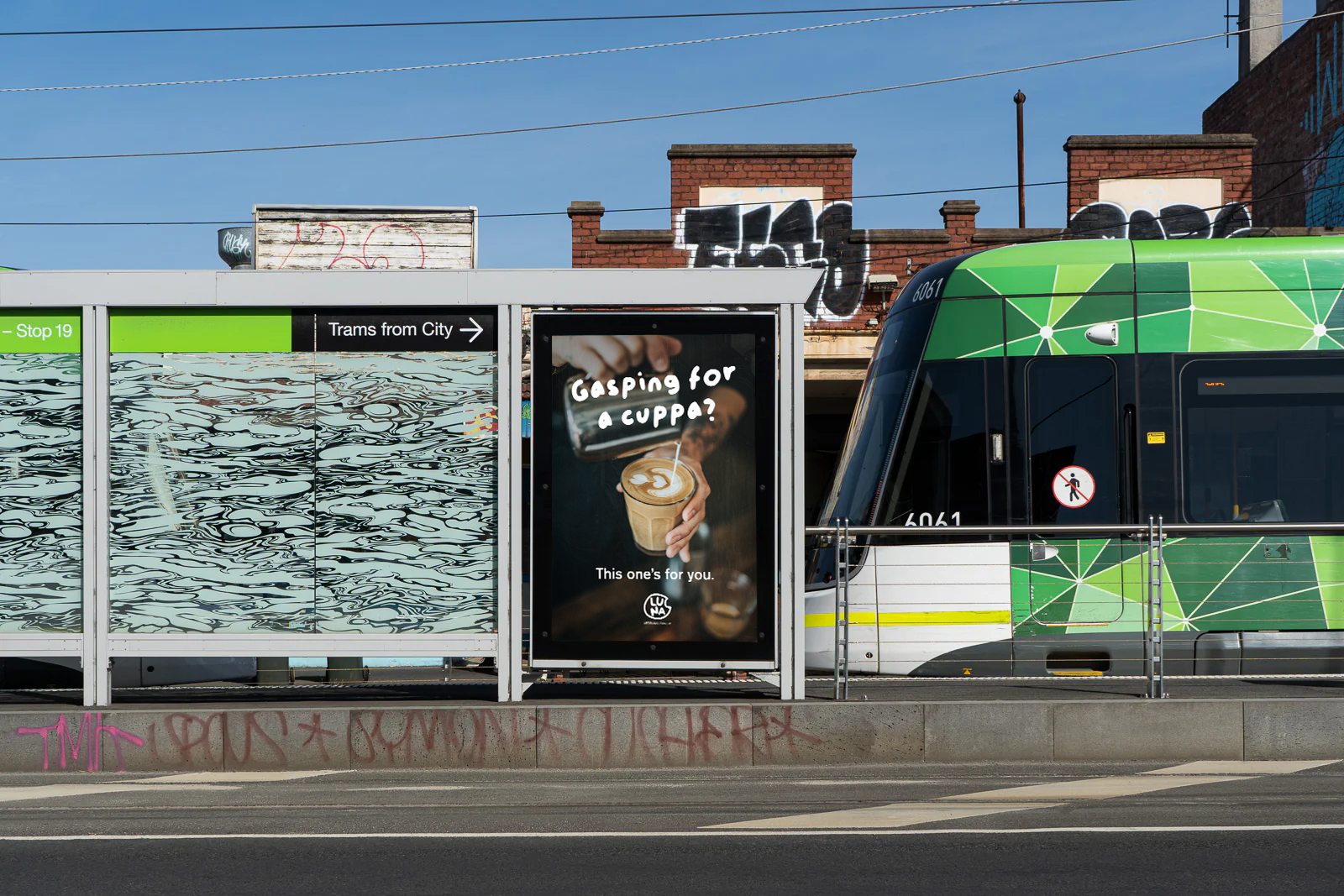
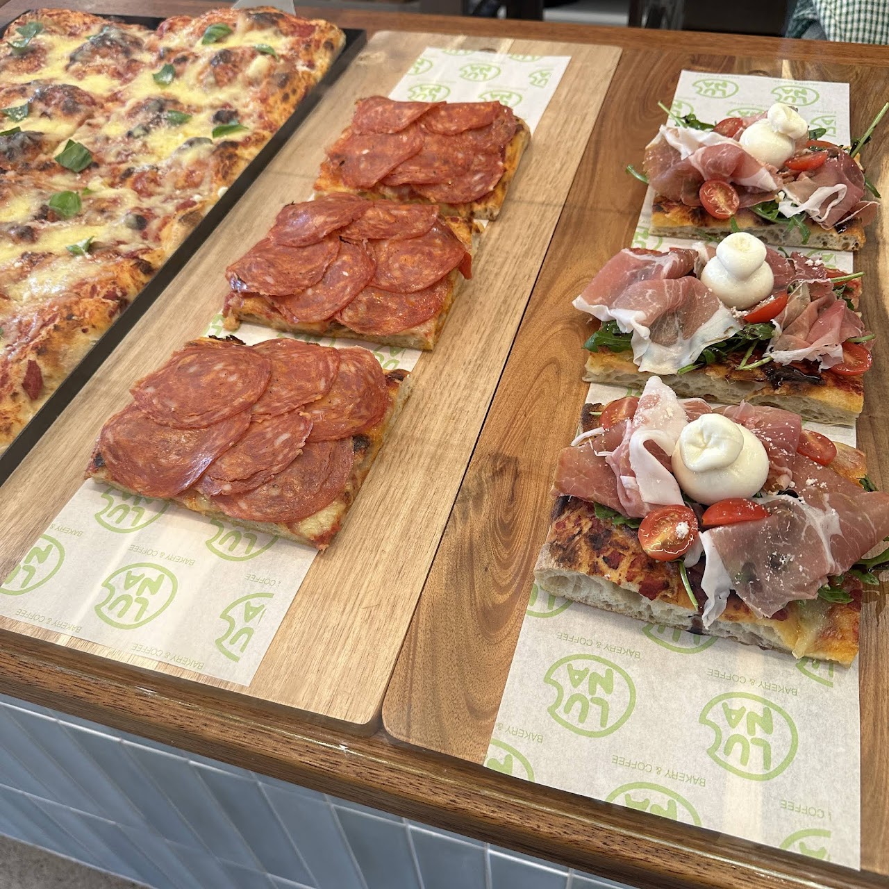
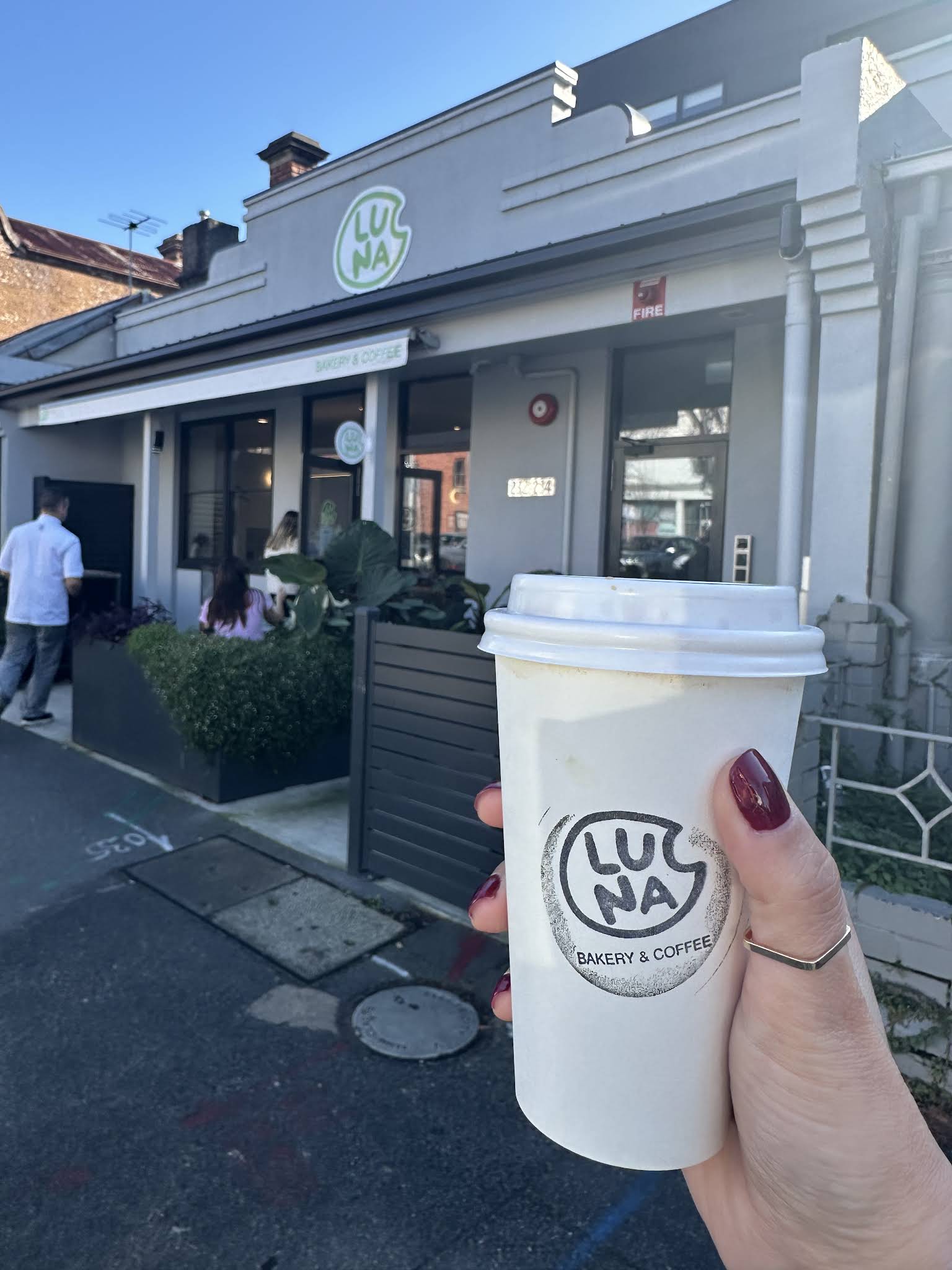
The identity was designed to work seamlessly across physical and city touchpoints, from storefront and takeaway cups to outdoor seating and advertising.
Shortly after opening, Luna Bakery was officially included in the City of Melbourne’s guide, reinforcing its relevance within the local café and cultural scene.