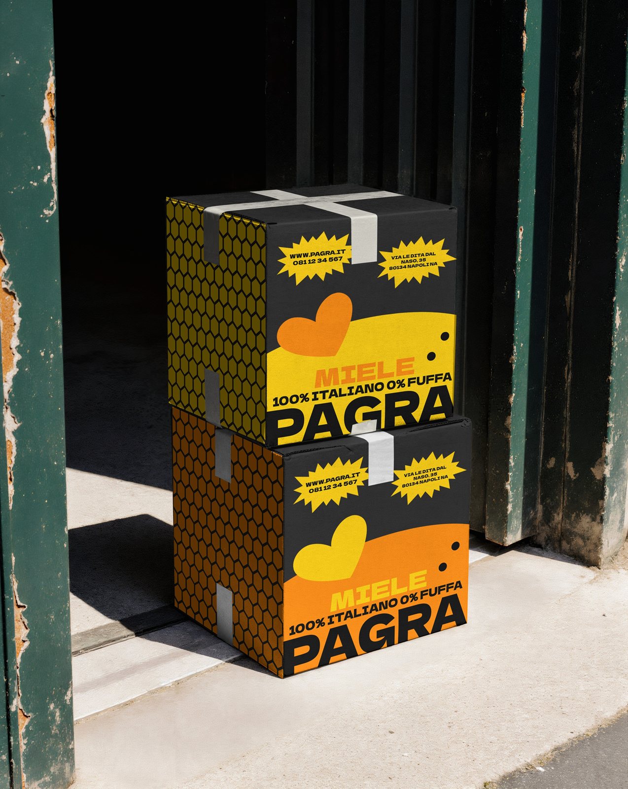
PAGRA
Concept
PAGRA is a new honey brand that celebrates naturalness, authenticity, and contemporary spirit. The challenge was to create an identity that unites genuine values with modern energy—distinguishing itself through clarity, visual harmony, and narrative coherence.
The goal was to craft a simple yet recognizable project capable of transmitting positive energy and transparency, speaking to consumers with sincere and immediate language. From this need emerged a research journey built on color, balance, and meaning, where every chromatic and graphic choice contributes to a coherent and natural story.
Color & Typography
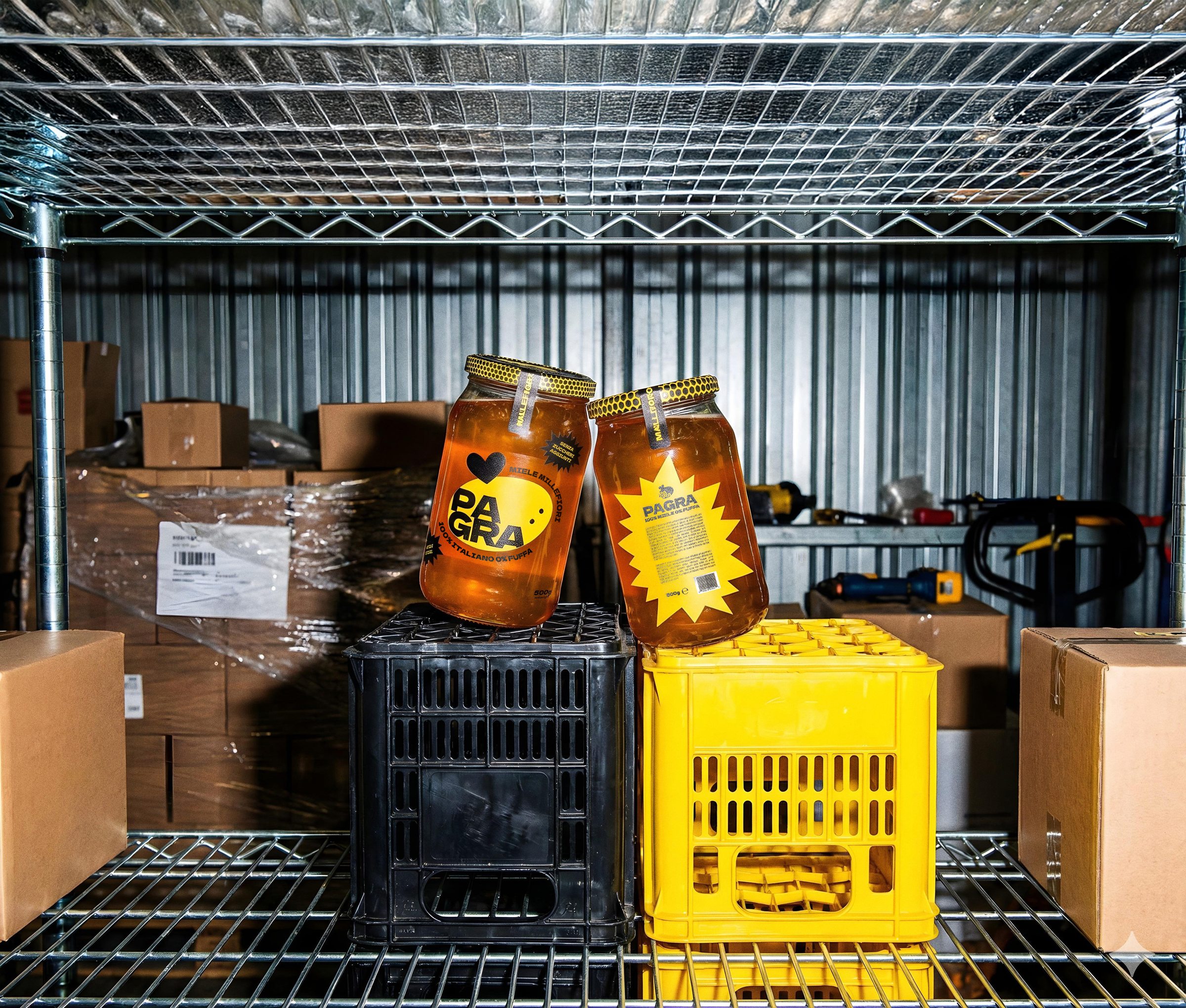
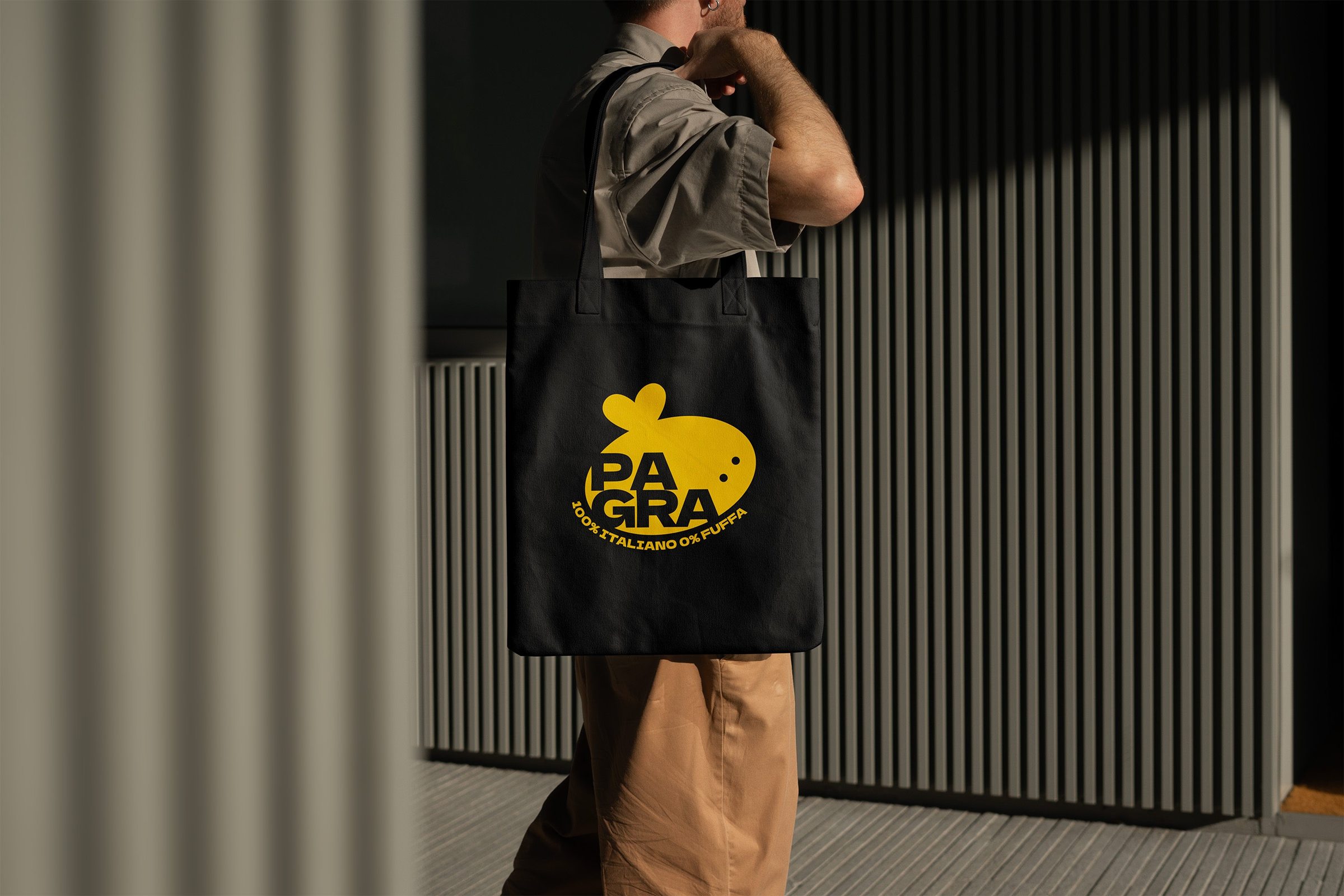
Jonquil yellow (#FFCE00) was chosen as the primary color because it embodies the very essence of honey: naturalness, warmth, and vitality. It's a full yet authentic tone that transmits optimism and transparency. Visually, it dialogues directly with the honey inside the jar, creating an effect of continuity and authenticity.
Black introduces decisive, contemporary contrast—making the brand legible, iconic, and recognizable even from a distance. This balance between energy and rigor perfectly synthesizes PAGRA's personality: a natural brand with pop language, artisanal yet direct, unafraid of color or simplicity.
The bold Dela Gothic One typeface unites strength, irony, and authenticity. Its geometric forms convey solidity and sincerity, while its decisive, slightly retro style creates a pop and familiar language that makes the brand immediately recognizable.
The Logo
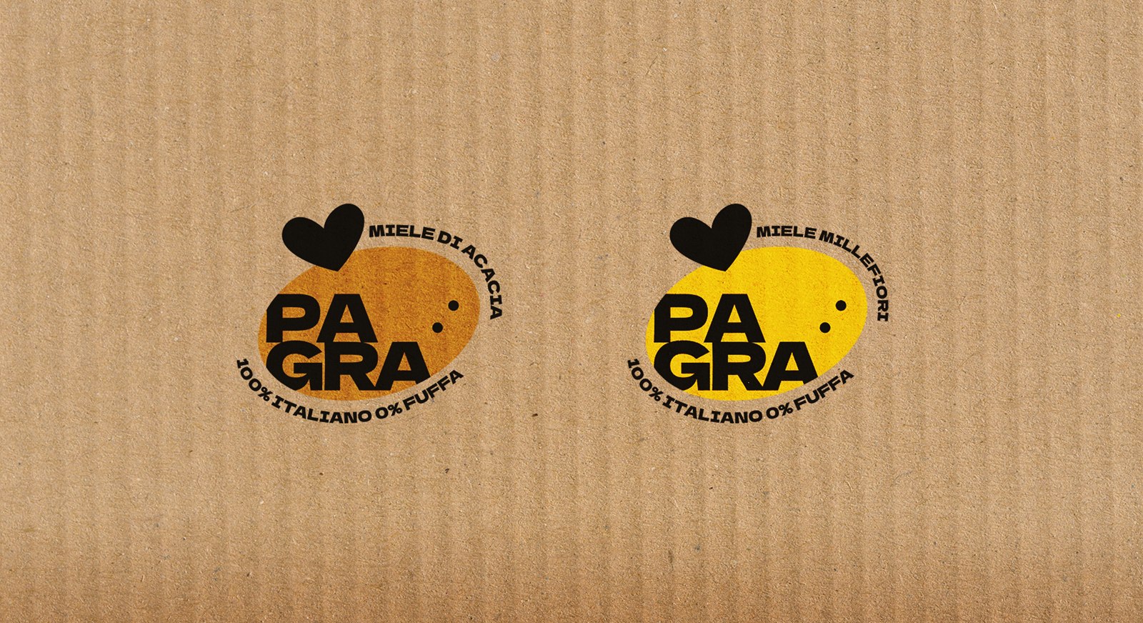
The logo features a simplified bee character where the wings are highlighted and take the shape of a heart—a playful element that can be used throughout the branding. In the colored version, the bold typography simulates the black-on-yellow pattern of real bees. The friendly claim "100% ITALIANO 0% FUFFA" (100% Italian, 0% Fluff) brings the brand closer to younger audiences while reinforcing its genuine nature.
Two color variants were developed to ensure optimal visual contrast with the natural honey color inside each jar: an amber version for lighter acacia honey, and the bright Jonquil yellow for warmer wildflower honey.
Supporting Elements
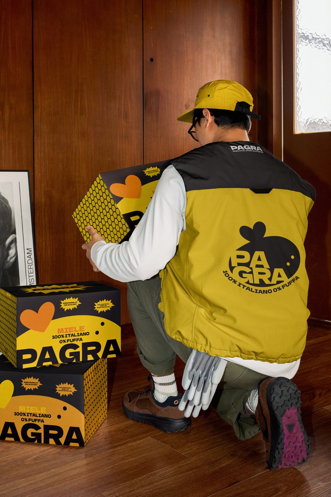
Custom honeycomb patterns were developed in both brand colors, derived from the natural imagery of honey and bees but reinterpreted in a geometric, pop key. These patterns maintain coherence with the brand's ironic and contemporary tone, appearing across jar lids, labels, promotional materials, and digital applications—reinforcing visual recognition and graphic consistency throughout the entire brand system.