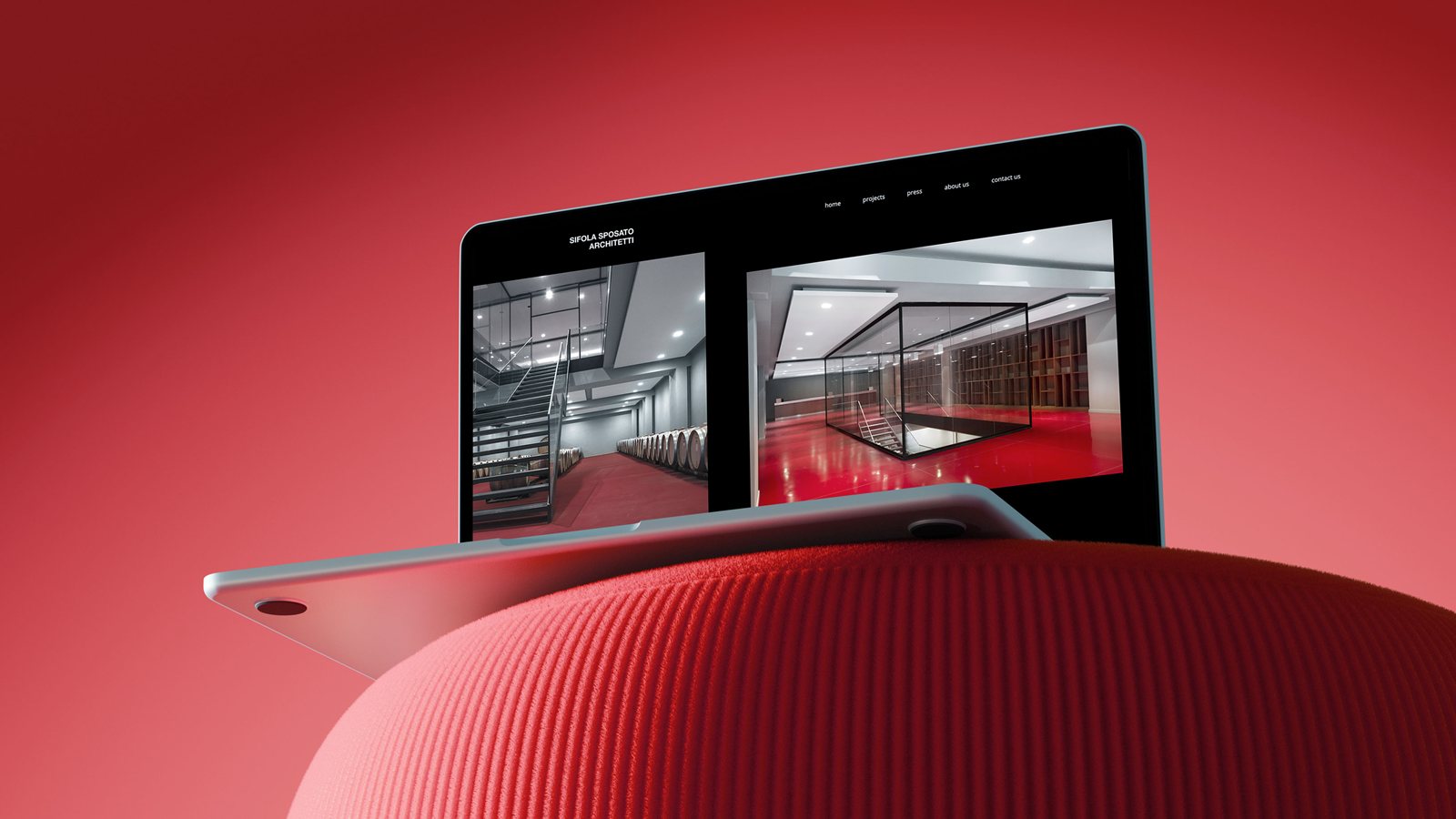
Sifola Sposato
Architetti
Every vision deserves an effective narrative. In architecture, every space tells a way of seeing the world. A website for a studio should do the same: transmit an identity, a measure, and a vision.
The new digital home for Sifola Sposato Architetti was born from the idea of creating a place that reflects the precision, balance, and care that define every project of the studio.
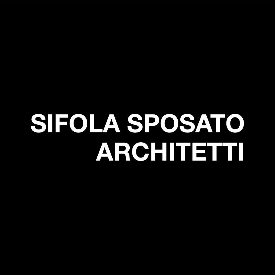
Starting from the original logo, we performed a subtle but targeted restyling. The primary gesture was the right-alignment of the word "Architetti", a choice of balance designed to make the mark more stable and contemporary.
The typographic structure based on Helvetica remains faithful to the studio's original identity, but the new layout enhances its readability and rhythm by using Helvetica Now and aligning it with the visual language of the new website.
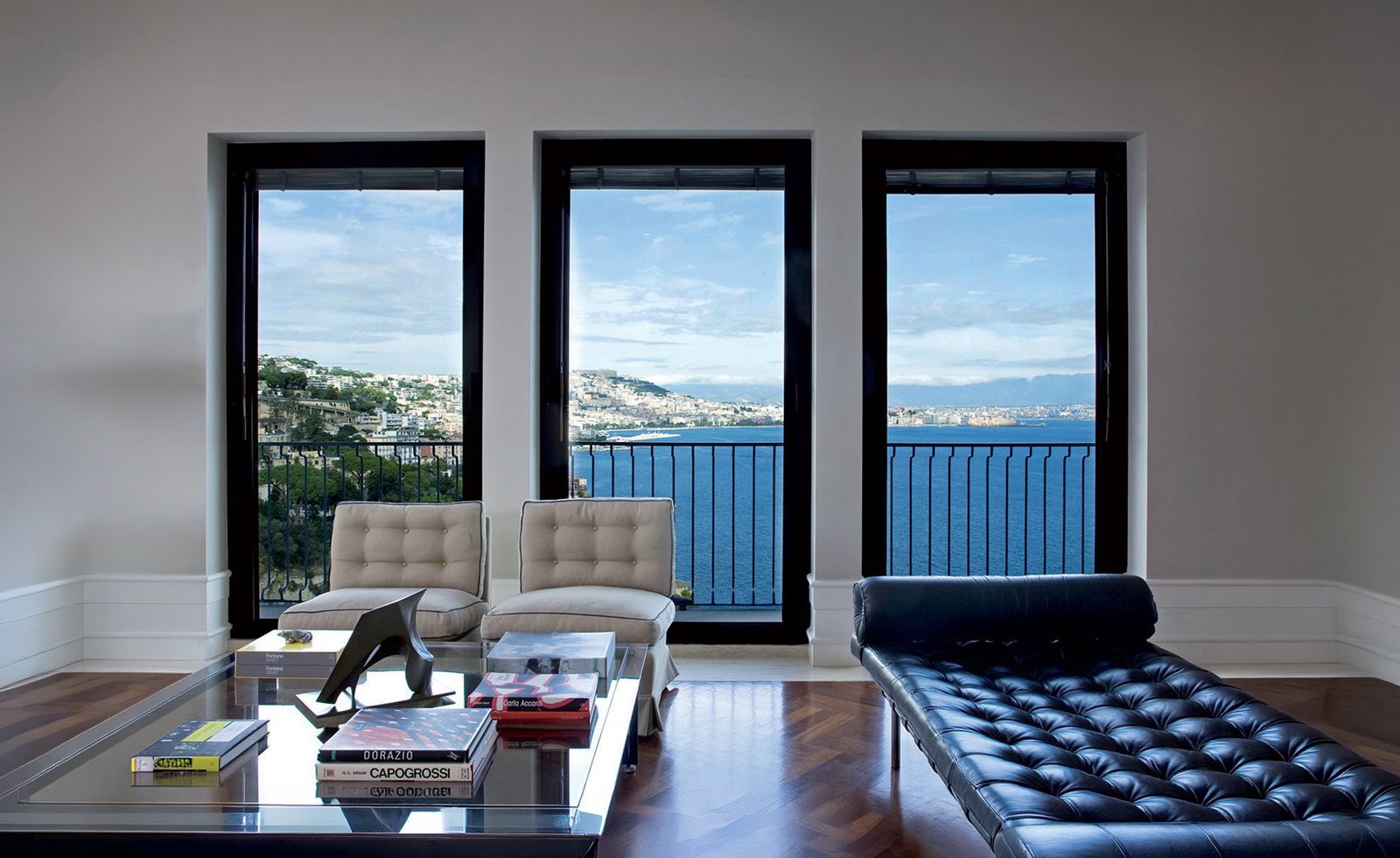
Sifola Sposato's work is distinguished by a design language that alternates essential modern volumes with traditional references. This equilibrium between formal sobriety and material richness inspired the entire interface design.
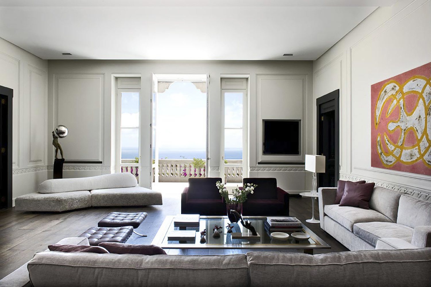
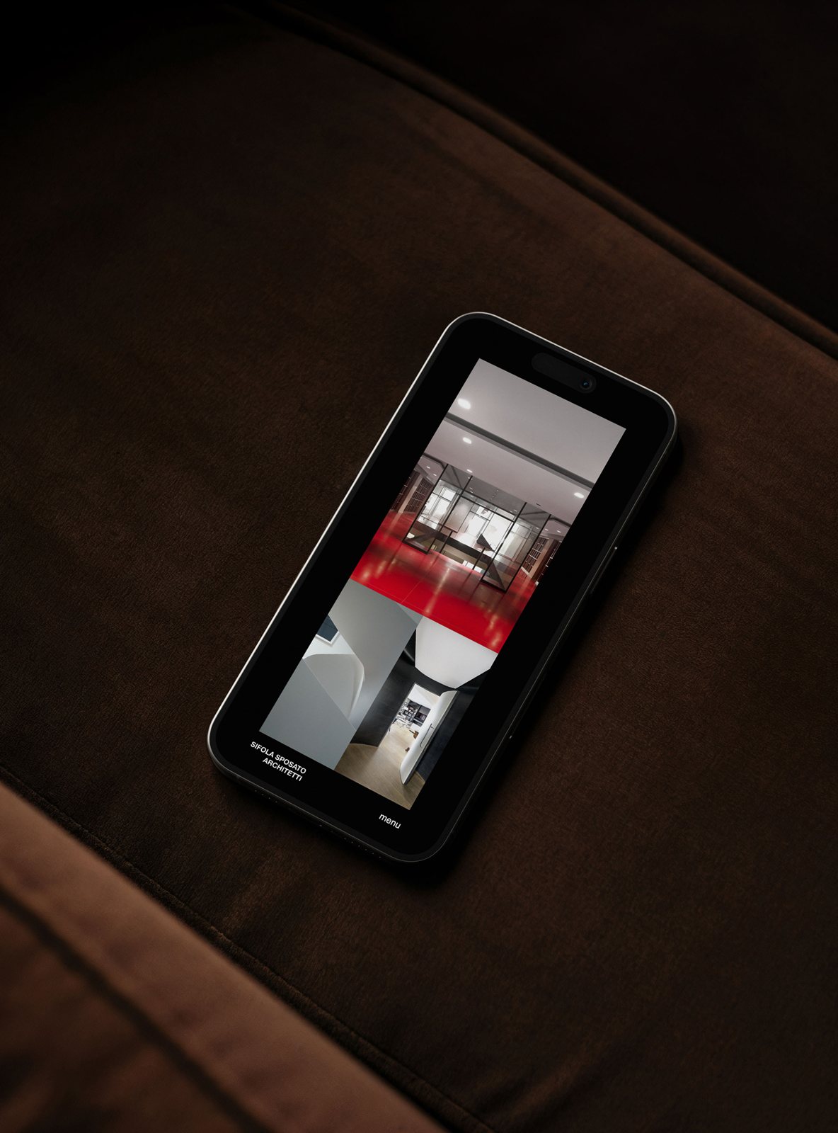
The website is not a simple container of images, but a coherent and intuitive experience. The navigation features a dynamic "curtain" opening animation and a menu that transforms as the user scrolls.
For the Projects and Press sections, I conceived a "visual archive in motion." A minimalist typographic list on a black background serves as the backbone; as the cursor hovers over each entry, a preview image appears, giving depth and rhythm to the discovery of the studio’s portfolio.
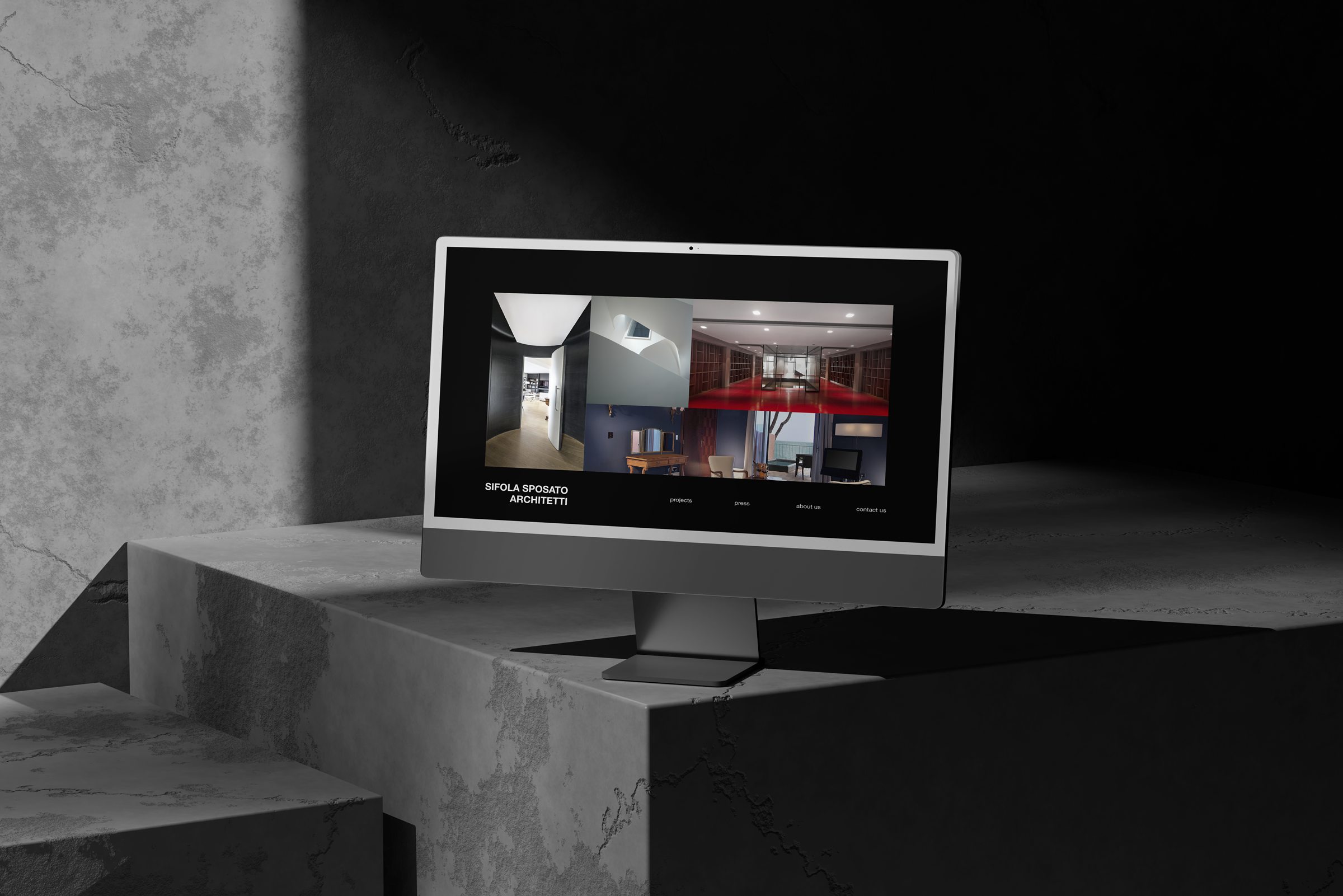
Once a project is selected, the experience continues in a horizontal-scroll gallery. This fluid gesture accompanies the user through the images as if walking through a sequence of rooms. The black border, which initially frames the images, fades away during navigation, allowing the architecture to occupy the entire space.